Philip Simmons Foundation
UX Designer - Web & Mobile Redesign
Project Overview
The Problem
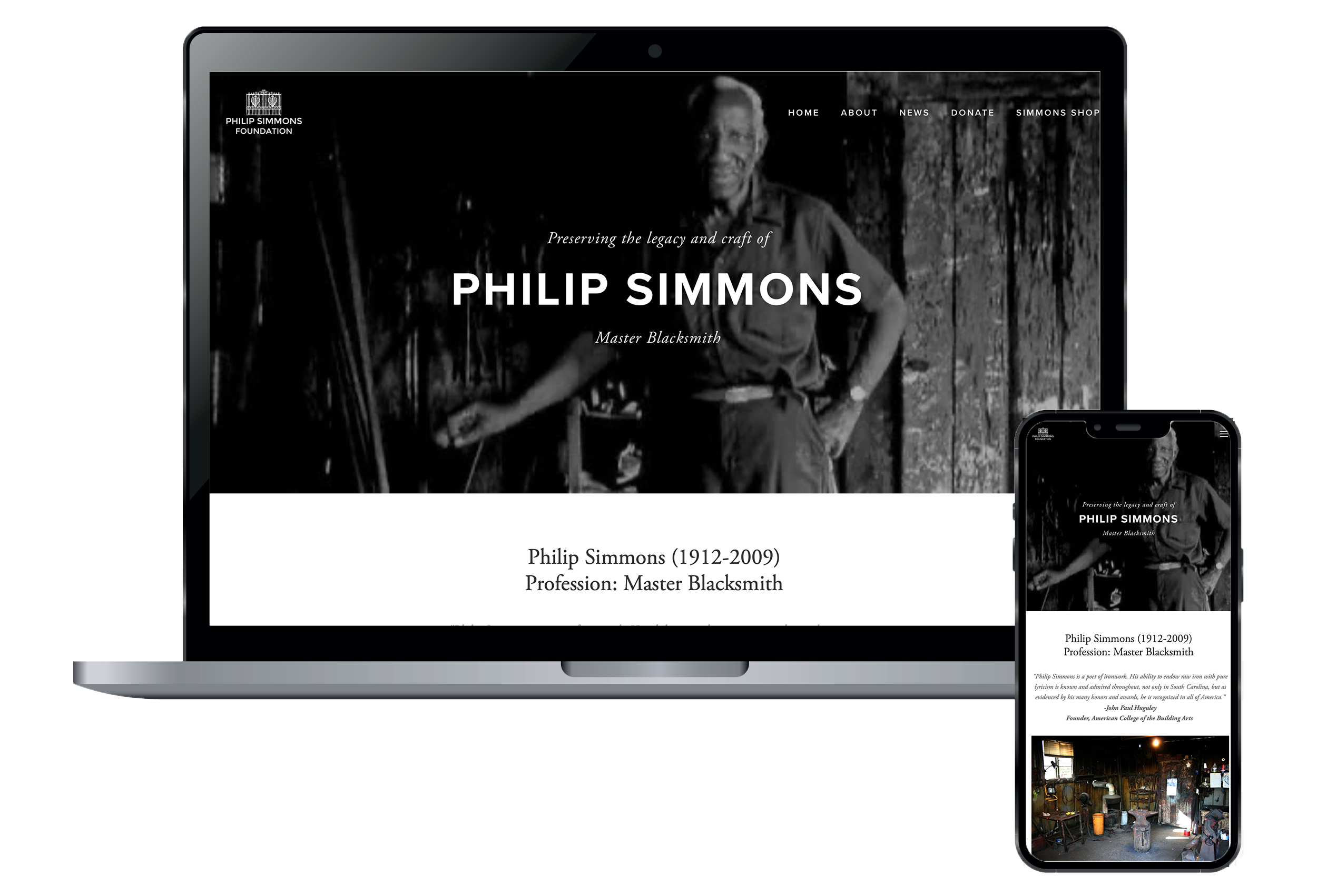
Philip Simmons Foundation’s website was outdated, hard to navigate, and not optimized for mobile devices, leaving visitors frustrated and unable to find the information they needed. The goal was to replatform their website onto Squarespace, which would give it all the current responsive technology updates and a cleaner navigation.
Process
My journey with Philip Simmons Foundation actually began in college as a student internship. I redesigned their original website in 2006 using Dreamweaver (how far we’ve come since then!). The main purpose for that redesign was to allow users to purchase jewelry and other merchandise based on Mr. Simmons’ ironwork designs through PayPal. This was an important revenue stream for the non-profit. Some years later, as technology improved with e-commerce, and with the increasing important of designing for mobile devices, I recommended that the website replatform again to Squarespace. After giving the current site a thorough audit, I created wireframes and information architecture for the new website, carefully including remedies for all pain points from my research. Creating the website in Squarespace meant that I could quickly and easily go from wireframes to a high-fidelity prototype for the Philip Simmons team to approve. Finally, after completing a usability study and making a few tweaks to the designs, I launched the site.
Outcome
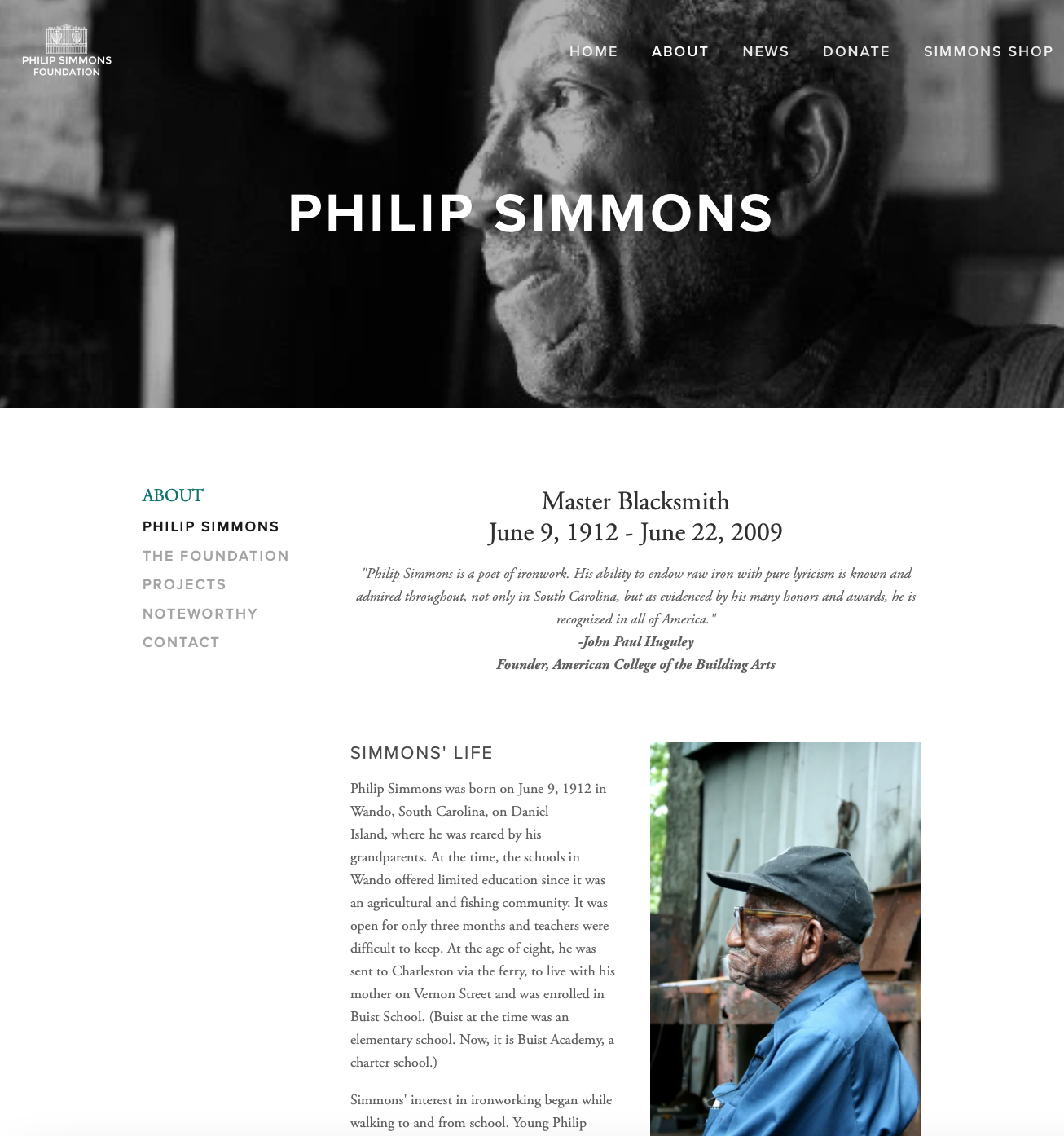
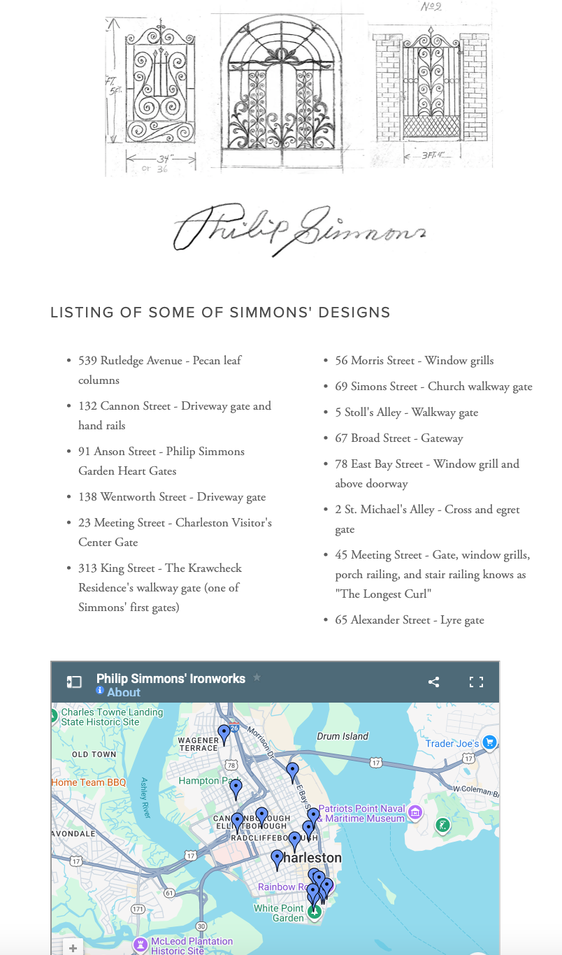
My approach was to keep the navigation super clean and minimal, with a clear Donate and Shop link at the top navigation menu. I also wanted to make sure that a map of Mr. Simmons’ designs would be easy to find, for those that wanted to view his work in person around Charleston. The result was an easy-to-navigate website that led to improved clarity for the user.
More Case Studies
Haus of Heckler
Natural Gathering Grounds